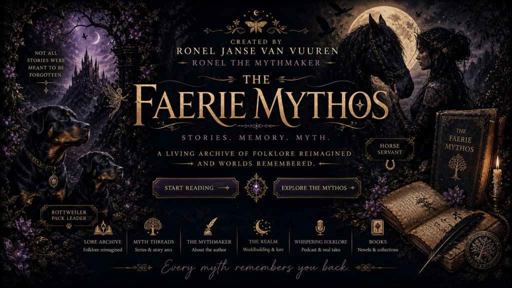
A New Sigil: Rebranding Ronel the Mythmaker | Author Website Update
It’s the first Wednesday of the month and time for another posting of the Insecure Writer’s Support Group.
I’m still at #38 on the list.
The awesome co-hosts for the August 5 posting of the IWSG are Shannon Lawrence, Diedre Knight, Liza, and Pat Garcia!
August 5 question: As a writer/author what is something you regret? Or something that you wish you’d done differently in your writing process?

There are moments in a creative life when the work no longer fits the shape it began in. When the edges outgrow their frame. When something within the stories quietly asks to be seen differently. This is one of those moments.
Ronel the Mythmaker is undergoing a rebranding — not as a departure from what came before, but as a refinement of what has always been forming beneath the surface. A new sigil has emerged to hold this identity: not to replace the old, but to better reflect the world the writing now belongs to.
This post is both an unveiling and an invitation — into the visual language, the shifting structure of my author website, and the evolving mythos behind my work.
Author Rebrand Update: Why I’m Redefining Ronel the Mythmaker
I could’ve titled this “Time for a Rebuilding Update” but there’s so much more to cover.
I’ve been spending months rebuilding my author business after I’ve made the decision to no longer use Draft2Digital to aggregate my books to all the digital stores I cannot access as a South African author. You can read all about the reasons behind that decision here. I had decided on selling books direct to start with, which you can read about here.
Though some decisions had come from bad things happening, I had made a list of all the good, too.
I went back to the start of my career (decades!) and looked at the writing that felt right. That led me to rediscovering Magic at Midnight. I read the reviews, watched the original launch, and realised that it was a world worth expanding (it’s still my most popular book). The Midnight Courts series was born. Though I’m still writing the series, I thought it worth mentioning here as a positive.
My coach has been reminding me to celebrate the small stuff, too. Yes, that’s another change I’ve made: I got a book/life/author coach. She’s really great and can handle my ADHD and endless questions. Instead of continuing my usual learning through webinars this year, I invested in one-on-one coaching. It’s been paying off.
We did a full audit of my catalogue and decided where to trim the fat: Two pennames have been shelved indefinitely (low sales, and I don’t enjoy writing them anymore). My most lucrative penname has been moved to Publish Drive (you pay according to the size of your catalogue, so it makes sense to only have the penname which pays for itself in there. Great tools!). And a new penname I wanted to start was scrapped because it turns out the books I want to write fits with my Ronel the Mythmaker brand.
Though my Ronel the Mythmaker books aren’t as widely available anymore (no Barnes & Noble or Apple books right now), Kobo does have global reach. Through Kobo, my books are available in many different stores globally (I’ve been able to verify that my books are available on Chapters Indigo besides the various Kobo stores).
When I started blogging back in 2015, it was because I needed an author platform if I wanted to get published. I didn’t know about indie publishing, and was still pursuing a trad deal. Over the years, I learned so much from other authors: about different publishing paths, career trajectories, community building, and more. Blogging turned from something I had to do, to something I enjoyed doing. Especially folklore posts. These became my content marketing pillars: blog posts, YouTube videos, podcast episodes, etc. Without it feeling like work, I created an author platform I can easily maintain. And from that, the true Ronel the Mythmaker was born.
Through loads of conversations (and arguments!) with my coach, I’ve made a proper “big picture” of my career and defined my long term publishing goals for a lasting legacy instead of momentary trend chasing.
What the New Ronel the Mythmaker Brand Represents
When someone reads one of my books, intricate worldbuilding, gothic vibes, strong characterisation, and a story that makes you feel, has always been central.
I now need to bring that forward in all ways I present my books and brand. I always focus on faeries and folklore, but I don’t always communicate my brand well.
Ronel the Mythmaker has always been there, she’s just being brought into sharper focus with a blend of folklore, dark academia, faery, and gothic tones in this shift from “blogger/writer” to “world-builder/publisher” identity.
The Evolution of My Author Website and Online Presence
The last couple of months, I’ve been rebuilding and reorganising my website to reflect my Mythmaker identity. I did some tinkering on the various other platforms I use, too, though they still need a full overhaul.
It’s not just changing graphics to match the gothic tones I’m embracing, but also making sure that everything feeds into the world I’ve created. I’m no longer an author who does content marketing: I’m a world-builder. When you land on The Portal (home page), there are so many places you can go to and each of those destinations lead you to more things to discover in The Faerie Mythos. No longer do I just present you with a list of books/folklore articles/etc. and say “look if you like” – I’ve created actual reader journeys.
If you click on one type of folklore on The Realm you will find everything you need to learn more about what you searched for and more. You’ll even find how everything is interconnected across mythologies even if something is called a faery in one and a monster in another…
These connections meant I could no longer use a pre-built theme for my website. I needed to learn about actual website design to make this work… I could’ve hired someone to do it for me, but then I wouldn’t be able to change things. No. I prefer learning and doing some things myself.
I’ve even learned the proper use of tags and categories on a website; how SEO works now (for AI, search engines, and humans); how to optimise each post for reader experience and accessibility. Through these improvements, I’ve also noticed what works and what doesn’t – not just what is evergreen content, but what I actually enjoy doing long-term.
Though I haven’t changed much concerning social media, I have been thinking about how to show up there. The landscape has shifted. Some types of content perform better than others. But that’s something for later.
Visual Direction: Dark Academia, Faery, and Gothic Mythmaking
I love butterflies. I especially like butterflies who eat corpses.
During the redesign process, I come up with a whole language for my brand in colours, sigils, and typography.
For the website, Cinzel Decorative was chosen for titles and a readable serif was chosen for the body text – it all supports the gothic elegance of the Ronel the Mythmaker brand.
What I love about this is that I can lean into the types of designs I’ve always liked instead of whatever is trendy right now. I’ve officially moved away from a trendy authorpreneur, hustle-culture mindset and into the type of stylistic choices which have always felt most like me. Which is the point of a brand, isn’t it?
As part of the visual redesign of my brand, we also looked at my covers… Only Magic at Midnight aged well. Everything else needed an update.
Here’s an example from The Faeries & Folklore Audiobook Library:
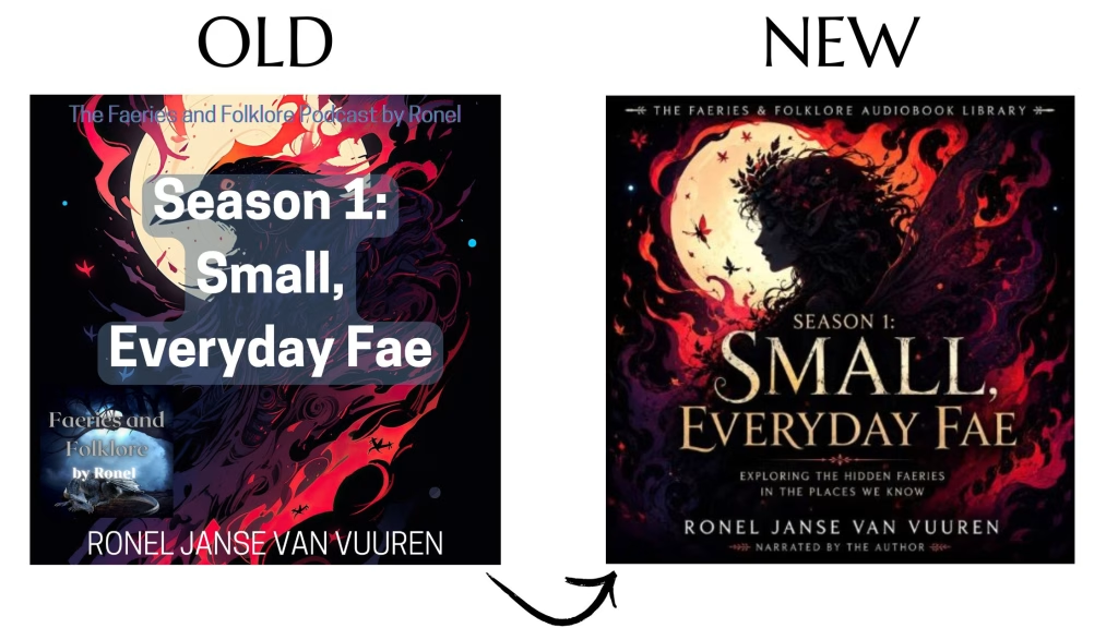
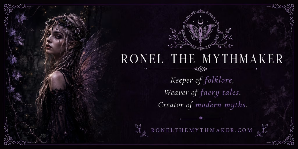
I’m going for elegant with gothic vibes. Which is reflected not only on the new covers, but also the images used on the website. My new book cover designer is brilliant. She even created some other images for me (like the base graphic for the blog banner above and the graphic in the footer of this post).
Though some images are still sourced from places like Pixabay, Pexels and Unsplash, I’m aiming for a more elegant, dark gothic aesthetic and less clobbered together in Canva Disney-cute. Apparently my images have been giving the wrong impression of what I write…
Even my brand colours have been made darker. It’s still pink and purple and blue and green and… but in much darker shades than I’ve been using. The colour palette is all dark purples, parchment tones, and antique gold accents (with variations into dark greens, blues and pinks, and antique silver).
Sigils, butterflies and faery motifs are used consistently across the website, social posts, newsletter and more. You can learn more about how I use seals as sigils for my folklore posts and podcast here.
The Meaning Behind the Sigil and Branding Elements
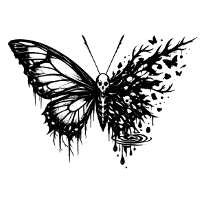
I just love this sigil. It symbolises everything in my brand: transformation, storytelling, memory, myth… it’s all there in one image.
I already said that I love butterflies. In art, especially from Victorian times, faeries had butterfly wings. Having this as a visual identity for my brand (used sparingly) reminds me, not just the reader, what my books are all about.
What Has Changed on the Website and Blog
So many graphic updates! And yes, I added alt text for each image to make the site more accessible.
Not only did each folklore post require a new banner, I had to source the right images to fit the new feel of the brand (no longer cute faeries on images!).
Here’s a screenshot from Pinterest comparing the old covers with the new style:
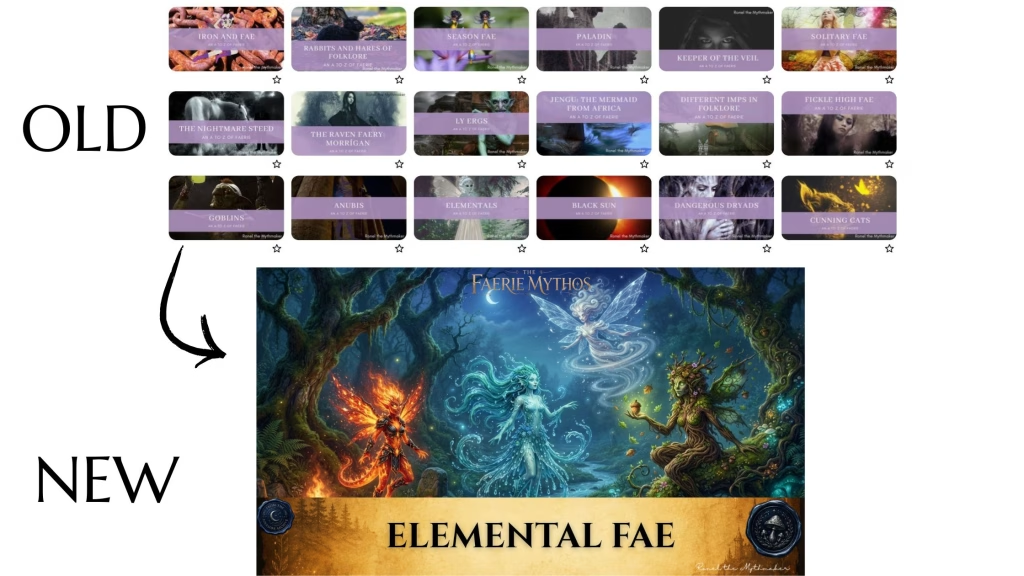
I also had to update the podcast posts with new banners. Some things just needed some polishing…
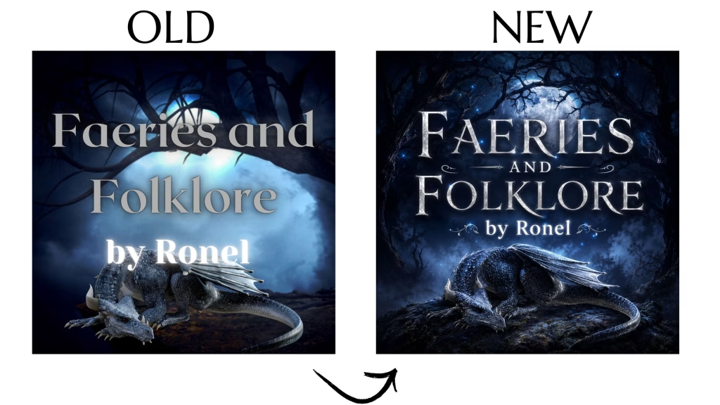
Then all the metadata of each post had to be updated for SEO and the new site navigation (e.g. a tag for solitary fae will give you all the folklore posts, podcast episodes, and books containing solitary fae). This, of course, is an improved structure for navigation and the archive.
I also had to update certain posts to better reflect the brand. Instead of just a new book announcement with cover, blurb, buy links, book trailer and book club questions, I’ve completely expanded such posts to be true book companions. You can take a look at the book companion post for Magic at Midnight here. I even remade the book trailers…
In some ways this feels cosmetic, but I’ve been assured it turns the content evergreen.
What Stays the Same in My Writing and Stories
What I write hasn’t changed at all. I’m still the same Mythmaker, just in better packaging. LOL. My coach said that my writing is great (she told me how awesome I am, but let’s stick with “great”), but my packing is lacklustre and off-brand (she might’ve said some words that actually means it sucks). So instead of being stubborn, I’m following the lead of the experts I’ve hired.
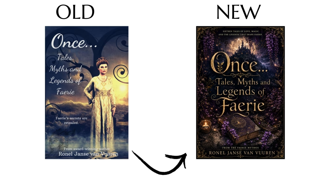
They might be on to something…
There’s so much folklore to reimagine, stories to write, and rabbit holes to wander down – there’s no way I’m giving that up.
What Comes Next for Ronel the Mythmaker
Right now, as my health allows, I recording audiobooks and getting them ready for publication.
Next month, I’ll unveil the rebrand for the Irascible Immortals series and share the changes I’d made so it can be its best (including ISBNs registered to me instead of the free ones from D2D and Amazon).
As part of digging into my old writing, I uncovered that which made me an award-winning author. It’s weird that I didn’t pursue these stories as they are key to the Faerie Mythos and all I’ve built. I’ll be sharing more on that writing adventure in October.
Yes, things seem to be more structured now that I have someone who reminds me what to focus on…
Entering a New Era of Mythmaking
I did a lot of work initially to create my direct stores and upload all my books… Only to realise that some won’t be for sale anymore. Even the store images I originally created had been replaced with ones that underscore my new branding. I had to redo my book pages on my website, not just to reflect my new publishing strategy, but also to remove books I no longer sell.
It sounds terrible, but this has forced me to make tough decisions I’ve been deferring and to get work done I’ve been arguing with my inner child with (“I don’t wanna!”).
I might be a bit tired (it’s only the start of spring and I missed my winter hibernation), but I’m satisfied with all I’ve accomplished. And once I have a print on demand partner, there will be no stopping me.
This rebrand isn’t about becoming a different author. It’s about finally building a home that fits the stories I’ve been writing all along.
Have you been following along with my journey to rebuild my career? What have you done to change your author business this year? Any tips you’d like to share?




The new covers are great! We grow and change as writers so everything around that should also grow and develop.
Thanks, Alex.
Impressive and best of luck with it. This reflects a lot of work. Good for you!
Thanks, Susanne.
I really like your new covers too. It’s great that you hired some consultants to help you with your rebranding.
Thanks, Natalie.
Congratulations on the extensive rebrand, which can infuse more energy and fun into your writing. I prefer the new to old in every instance you shared in this post. Hiring a coach sounds like a wonderful idea.
Thanks, Jennifer.
Crikey Ronel, that’s a huge amount of work. I’m bowing down in awe at your industry. Of course, you’re right. If a thing’s worth doing, it worth doing the best you can. (Runs and hides in a corner. I believe that, but somehow, doing it is a whole Other Thing.)
I hope it all works well for you.
Thanks, Jemima. Yeah, I would prefer to have been able to run and hide, but someone had to step up. LOL.
I’m in awe of the amount of work you’ve put in on all this. And somehow you are still writing? I don’t seem to have the bandwidth to both write and manage my “author platform” (in quotes because it’s pretty much a joke). I do love the new covers and graphics!
Thanks, Rebecca. I don’t even know where I get all the energy from… But yeah, new books coming soon!
Wow, this sounds like a ton of work, but very worthwhile. The new images look really good! I’ve been trying to figure out a good picture and slogan for in-person tables and such so I can make a banner that doesn’t need to change. Not there yet.
Thanks, Shannon. It’s all about figuring out what your brand truly is, cutting away all the extra stuff and drilling down to the core. Good luck!
I am breathless over how much work this is–but the changes are beautiful (wrong word for gothic I’m sure!).
Your new covers and memes pop. Kudos on all your hard work.